
Data and Visualization with Jupyter
Jupyter notebooks were originally conceived of as a portable means of combining code and written research, and in my opinion an excellent environment for exploring data and toying around with different data engineering operations.
Jupyter notebooks are made up of text blocks in either code or markdown. Markdown is a quick and efficient way of writing text and formatting all in one go. I already showed you how to write comments in code, but with markdown you can write detailed explanations of what your code blocks are doing or give commentary on what’s being outputted by adjacent code cells.
Jupyter also nicely outputs tables and graphs that your code produces and allows you to run your code in a step by step manner. Meaning that you could load a datasource in one cell and then write any number of cells that perform different operations on it allowing you to then evaluate which direction your eventual analysis or program will go.
In this next part we’ll go over the basics of running jupyter notebooks by doing some basic data processing.
you can download the code samples for this tutorial series from this github repo
Overview
- Firing up Jupyter Lab
- writing and running markdown and code cells
- performing operations on columns and rows of data
- Filling missing values
- splitting up our dataframes along certain conditions
- Data Visualization with Seaborn
- converting to markdown or html
Starting up Jupyter lab
If you’ve already installed Anaconda you already have Jupyter notebooks the base component that we’ll be working with. While basically everything I’m going to describe is present in vanilla jupyter notebooks. The whole Jupyter project is moving towards it’s more recent incarnation Jupyter Lab and as of the writing of this tutorial Anaconda comes prepackaged with Jupyter lab.
To start Jupyter Lab, open up a terminal in your project folder like last time and enter the command:
jupyter lab
Your web browser should pop up and if this is your first time running jupyter you’ll be asked to add in an authentication key. Back in your terminal you should see a bit of text saying Authentication key= and a bunch of random text. That’s your key, now copy and paste that into the window that just popped up in your browser using the mouse not a keyboard shortcut like ctrl+C1.
Once that’s done you should see a window like the one bellow:
From here launch a python notebook, which you can do by clicking on the Python 3 emblem right bellow the orange symbol that is conveniently labeled ‘notebooks2’.
This should bring you to an image like the one bellow:

The first text area in the notebook is by default a code block and I would suggest trying to write some code in there right now just to get a feel for what jupyter and it’s underlying iPython notebook is all about. Each text area or cell in jupyter’s nomenclature is kind of like a miniature script yet the variables, functions, and objects are shared between the different cells.
Adding cells, changing a cell from Code to markdown, running cells, can all be done from the application’s interface but I’ll share with you two shortcuts that I think are important
SHIFT + ENTER will execute a cell and create a new one bellow it
ESC + M will turn a code cell to a markdown cell while replacing the M with a C will turn it back to a code cell
Feel free to explore the interface and get comfortable with it. And don’t be afraid of breaking anything, right now there really isn’t too much to break.
The left hand panel of the jupyter interface should reflect the directory that you ran your jupyter server in. Open up a Jupyter notebook from the launcher tab and follow along with what I have bellow.
Data Engineering and Visualization
From here on out the rest of this post was originally composed in jupyter lab but converted into this webpage. You can read about converting jupyter notebooks into a variety of file types here
loading the data
The next cell simply loads up our data like we’ve done before but note that the code cell will nicely output certain objects out into the area bellow the cell, in this case our loaded pandas dataframe. This is one of the greatest things about using jupyter both for creating presentable data analysis reports and being more precise in our data engineering.
import pandas as pd
import numpy as np

df = pd.read_csv('Health Data.csv')
df.head(21)
| Start | Finish | Active Calories (kcal) | Body Fat Percentage (%) | Body Mass Index (count) | Dietary Calories (cal) | Distance (mi) | Steps (count) | Weight (lb) | |
|---|---|---|---|---|---|---|---|---|---|
| 0 | 15-Aug-2016 00:00 | 16-Aug-2016 00:00 | 0.0 | 0.0 | 0.0 | 0.0 | 10.273316 | 25305.000000 | 0.0 |
| 1 | 16-Aug-2016 00:00 | 17-Aug-2016 00:00 | 0.0 | 0.0 | 0.0 | 0.0 | 5.182135 | 12475.000000 | 0.0 |
| 2 | 17-Aug-2016 00:00 | 18-Aug-2016 00:00 | 0.0 | 0.0 | 0.0 | 0.0 | 6.099231 | 14898.000000 | 0.0 |
| 3 | 18-Aug-2016 00:00 | 19-Aug-2016 00:00 | 0.0 | 0.0 | 0.0 | 0.0 | 2.781500 | 6656.000000 | 0.0 |
| 4 | 19-Aug-2016 00:00 | 20-Aug-2016 00:00 | 0.0 | 0.0 | 0.0 | 0.0 | 2.507525 | 6886.000000 | 0.0 |
| 5 | 20-Aug-2016 00:00 | 21-Aug-2016 00:00 | 0.0 | 0.0 | 0.0 | 0.0 | 7.667634 | 16479.000000 | 0.0 |
| 6 | 21-Aug-2016 00:00 | 22-Aug-2016 00:00 | 0.0 | 0.0 | 0.0 | 0.0 | 5.303610 | 13738.900012 | 0.0 |
| 7 | 22-Aug-2016 00:00 | 23-Aug-2016 00:00 | 0.0 | 0.0 | 0.0 | 0.0 | 5.318299 | 13670.816762 | 0.0 |
| 8 | 23-Aug-2016 00:00 | 24-Aug-2016 00:00 | 0.0 | 0.0 | 0.0 | 0.0 | 11.042560 | 27476.650408 | 0.0 |
| 9 | 24-Aug-2016 00:00 | 25-Aug-2016 00:00 | 0.0 | 0.0 | 0.0 | 0.0 | 6.483847 | 14724.632818 | 0.0 |
| 10 | 25-Aug-2016 00:00 | 26-Aug-2016 00:00 | 0.0 | 0.0 | 0.0 | 0.0 | 5.033286 | 11507.000000 | 0.0 |
| 11 | 26-Aug-2016 00:00 | 27-Aug-2016 00:00 | 0.0 | 0.0 | 0.0 | 0.0 | 6.613589 | 16500.000000 | 0.0 |
| 12 | 27-Aug-2016 00:00 | 28-Aug-2016 00:00 | 0.0 | 0.0 | 0.0 | 0.0 | 7.857025 | 18001.000000 | 0.0 |
| 13 | 28-Aug-2016 00:00 | 29-Aug-2016 00:00 | 0.0 | 0.0 | 0.0 | 0.0 | 3.242202 | 7926.000000 | 0.0 |
| 14 | 29-Aug-2016 00:00 | 30-Aug-2016 00:00 | 0.0 | 0.0 | 0.0 | 0.0 | 2.735486 | 7388.000000 | 0.0 |
| 15 | 30-Aug-2016 00:00 | 31-Aug-2016 00:00 | 0.0 | 0.0 | 0.0 | 0.0 | 9.560934 | 20924.000000 | 0.0 |
| 16 | 31-Aug-2016 00:00 | 01-Sep-2016 00:00 | 0.0 | 0.0 | 0.0 | 0.0 | 5.502616 | 13451.000000 | 0.0 |
| 17 | 01-Sep-2016 00:00 | 02-Sep-2016 00:00 | 0.0 | 0.0 | 0.0 | 0.0 | 3.191603 | 7702.000000 | 0.0 |
| 18 | 02-Sep-2016 00:00 | 03-Sep-2016 00:00 | 0.0 | 0.0 | 0.0 | 0.0 | 3.182398 | 7259.795079 | 0.0 |
| 19 | 03-Sep-2016 00:00 | 04-Sep-2016 00:00 | 0.0 | 0.0 | 0.0 | 0.0 | 5.623553 | 14775.204921 | 0.0 |
| 20 | 04-Sep-2016 00:00 | 05-Sep-2016 00:00 | 0.0 | 0.0 | 0.0 | 0.0 | 2.291568 | 6164.000000 | 0.0 |
Let’s run that Correlation table again, note that in a jupyter notebook the last variable or object in the cell will get outputed in the area bellow the cell.
correlation_table = df.corr()
cleaned_corr_table = correlation_table.loc['Body Fat Percentage (%)':, 'Body Fat Percentage (%)':'Weight (lb)']

cleaned_corr_table
| Body Fat Percentage (%) | Body Mass Index (count) | Dietary Calories (cal) | Distance (mi) | Steps (count) | Weight (lb) | |
|---|---|---|---|---|---|---|
| Body Fat Percentage (%) | 1.000000 | 0.970407 | -0.028609 | -0.082021 | -0.096160 | 0.847321 |
| Body Mass Index (count) | 0.970407 | 1.000000 | -0.029500 | -0.080936 | -0.095188 | 0.873133 |
| Dietary Calories (cal) | -0.028609 | -0.029500 | 1.000000 | -0.049783 | -0.052001 | 0.253758 |
| Distance (mi) | -0.082021 | -0.080936 | -0.049783 | 1.000000 | 0.988318 | -0.085471 |
| Steps (count) | -0.096160 | -0.095188 | -0.052001 | 0.988318 | 1.000000 | -0.100933 |
| Weight (lb) | 0.847321 | 0.873133 | 0.253758 | -0.085471 | -0.100933 | 1.000000 |
Cleaning for better results
If you look at my correlation table above might find it odd that my Body Fat Percentage seems to be negatively correlated with my Dietary calories. The conclusion is not that I get less fat when I eat, it’s due to the fact that QS Access reports days when I don’t record calories as 0.
But in all likelihood, I did eat on those days so having them recorded as 0 is definitely inaccurate. While there’s no subsitute for accurate data collection. There are some techniques we can use to try and approximate what the accurate data should look like. For right now we’ll examine filtering out missing records, which is the most appropriate way to actually boost the accuracy of our dataset for further analysis. For some machine learning techniques its often recommended that you try filling in missing records with averages or other methods. These methods should be approached with caution, the more you move away from the truth the more likely you’ll end up with analysis that may look brilliant on paper but perform terribly in the real world. In most cases the right approach to solving the missing data problem is either go and collect it or to drop incomplete records.
Lets take a look at our dataset’s information again
df.info()
<class 'pandas.core.frame.DataFrame'>
RangeIndex: 944 entries, 0 to 943
Data columns (total 9 columns):
Start                      944 non-null object
Finish                     944 non-null object
Active Calories (kcal)     944 non-null float64
Body Fat Percentage (%)    944 non-null float64
Body Mass Index (count)    944 non-null float64
Dietary Calories (cal)     944 non-null float64
Distance (mi)              944 non-null float64
Steps (count)              944 non-null float64
Weight (lb)                944 non-null float64
dtypes: float64(7), object(2)
memory usage: 66.5+ KB
Working with the zeros
So right now the results of our .info call show no non-null values, but lets see if we can tease out how many of them are just zeros
We can do this with the .replace() dataframe method which replaces all instances of one value with another. I’m going to replace all the zeros in our dataset with NaNs which symbolizes the lack of an number Not a Number (NaN). Pandas has specific capabilities for handling NaNs that will come in handy later
df_drop_zeros = df.replace(np.int(0), np.nan)

df_drop_zeros.info()
<class 'pandas.core.frame.DataFrame'>
RangeIndex: 944 entries, 0 to 943
Data columns (total 9 columns):
Start                      944 non-null object
Finish                     944 non-null object
Active Calories (kcal)     0 non-null float64
Body Fat Percentage (%)    33 non-null float64
Body Mass Index (count)    35 non-null float64
Dietary Calories (cal)     29 non-null float64
Distance (mi)              930 non-null float64
Steps (count)              930 non-null float64
Weight (lb)                45 non-null float64
dtypes: float64(7), object(2)
memory usage: 66.5+ KB
Our suppy of viable data is starting to look a lot more pocket sized. Step counts and distance traveled is the most complete so we’ll be able to analyze it’s affect on the other variables the best. For my other stats the data coverage is much lower. But we can still perform some analysis none the less. In the real world complete data coverage is a goal but like a perfect circle rarely achieved.
In the follow code note that the same sort of logic that works on slicing pandas dataframes is present in standard python lists, which df.columns produces
for column in df_drop_zeros.columns[3:]:
    print(f'====={column}=====')
    print(df_drop_zeros[column].dropna().describe())
=====Body Fat Percentage (%)=====
count    33.000000
mean      0.241394
std       0.004993
min       0.233000
25%       0.238000
50%       0.240000
75%       0.244000
max       0.253000
Name: Body Fat Percentage (%), dtype: float64
=====Body Mass Index (count)=====
count    35.000000
mean     29.004782
std       0.326534
min      28.500000
25%      28.799999
50%      28.900000
75%      29.150001
max      29.809998
Name: Body Mass Index (count), dtype: float64
=====Dietary Calories (cal)=====
count    2.900000e+01
mean     1.136126e+06
std      7.218160e+05
min      1.924588e+05
25%      4.549175e+05
50%      1.179190e+06
75%      1.565385e+06
max      3.237495e+06
Name: Dietary Calories (cal), dtype: float64
=====Distance (mi)=====
count    930.000000
mean       3.190591
std        2.212937
min        0.020139
25%        1.585337
50%        2.520271
75%        4.239897
max       14.516899
Name: Distance (mi), dtype: float64
=====Steps (count)=====
count      930.000000
mean      8015.250538
std       5350.660654
min         56.000000
25%       4148.802587
50%       6422.362821
75%      10405.250000
max      33195.107360
Name: Steps (count), dtype: float64
=====Weight (lb)=====
count     45.000000
mean     203.465970
std        2.716901
min      198.967192
25%      201.282045
50%      203.045743
75%      205.470828
max      208.600000
Name: Weight (lb), dtype: float64
Questioning the Data
Now that we’ve cleaned our data somewhat we can start to draw insights.
By looking at the tables above I’m curious to see how my walking habits change on a weekend vs weekday basis, and maybe over the different seasons. Also seeing how much my walking has effected things like my weight and body fat percentage would be helpful as well.
When looking at your own data, do the same think of what you want the data to tell you, what do you want to know. It’s not that I think exploration for exploration’s sake is unproductive, I believe quite the opposite. Instead I do believe that in general we need an aim to move towards. It’s quite likely that the aim will change as you explore further but creating a few guiding stars helps with motivation and momentum. And in the tedium that often takes place in running and rerunning data engineering operations, frustration and indirection are as much a problem as technical issues and incomplete data.
Visualization using Seaborn
Visualization is a critical part of analysis. Typically we think of charts and graphs as a product but, with our programming skills we can create graphs in a relatively quick and iterative manner. Stats that are difficult to reason out as plain numbers are more easily discerned when presented visually. I also personally find making charts and visualizations fun and more enjoyable than simply pouring over tables. Also we may happen upon a chart that is exceptional and worth sharing, bringing finished products out of our data exploration. For these reasons I consider data visualization to be a fundamental aspect of Data Science that anyone in the field should be familiar with.
Seaborn is a statistical visualization library for python built on top of matplotlib a more fundamental chart making library. In keeping with the tutorial series’s aim of being a rapid approach to an end to end data science project I opted to focus on seaborn as our visualization tool.
Because it can create presentation ready graphs with just one or two lines of code instead of in 10 or more lines that a similar matplotlib graph would require. But as with most higher level tools, if you encounter issues the solution is often to go back to the lower level tool its based on and figure out the basics. Therefore if end up wanting to change some more minor aspect of the charts bellow, turn towards the matplotlib documentation.
If you don’t have seaborn installed, it’s a simple pip install seaborn to get it loaded. The following cell imports seaborn and gives it the standard alias of sns. There’s also some code that tells matplotlib (and by extension seaborn) to output plots to the area bellow the cell.
import seaborn as sns
# set matplotlib to plot directly to the notebook
%matplotlib inline
# set the (width, height) of our charts
import matplotlib.pyplot as plt
plt.rcParams['figure.figsize'] = (16,12)
weight = df_drop_zeros['Weight (lb)'].dropna()

sns.distplot(weight)
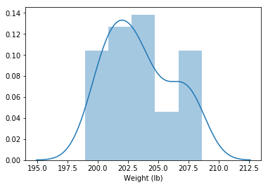
Chart options
Up next I’ll just demonstrate a few extra styling options. The easiest thing to adjust are the colors.
You can try out using the names of colors ‘red’, ‘orange’, etc or you can set the graph’s color with hexl values. There are a ton of websites out there that will generate hexl or rgb values for colors that you set. I personally like using coolors.co to generate entire color pallettes.
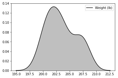
# same plot with just the lines (kde) with shading enabled and a different color
sns.kdeplot(weight, shade=True, color='black')
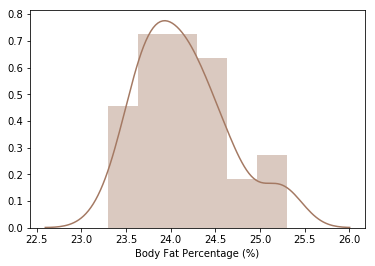
# Body Fat, just the historgram
bodyfat = df_drop_zeros['Body Fat Percentage (%)'].dropna()
# lets pretty format those percentages
pretty_bodyfat = bodyfat.apply(lambda x: float(x) * 100)

sns.distplot(pretty_bodyfat, color='#a47963') # setting color with a hexl value
# using seaborn's set style attribute
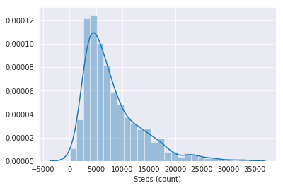
sns.set_style("darkgrid")
steps = df_drop_zeros['Steps (count)'].dropna()
sns.distplot(steps)
Time Series graphs
The above graphs deal with the distribution of our individual columns, basically how the values within the column vary amongst each other.
Especially after looking at the step data, I think it would be cool to analyze how my walking habits vary by the month and weekday.
To do so we’ll use pandas groupby operations.
Groupby does operations similar to pivot tables in excel, and allow us to work with our data in aggregations kind of like how we did with .describe().
In the case of our timeseries data we are going to first have to create two new columns:
Weekend: a boolean (true/false) column stating weather or not a given date is a weekend Month: the name of the month a given date falls on
Then when we do our group by operations we can analyze our data on these new levels. Pandas offers the handy .resample method for transforming timeseries. We’ll use the general pattern given by the docs.
The basic convention is as follows:
df.resample(timeperiod).aggregation()
Where timeperiod conforms to a short hand notation for a length of time, Note that you can combine a number with the notations to aggregate on custom intervals e.g ‘3D’ would aggregate a time series on every 3 days. Some common notations you may want to try
- ‘M’ for Month
- ‘D’ for day
- ‘W’ for week
- ‘H’ for hour
Also note that I end up assigning out df_drop_zeros variable to just be df. Typically when I do data engineering operations I reserve the variable name ‘df’ for the main dataframe I’m working with. This starts out with the raw data but once I feel comfortable that a transformed piece of data is what I’m going to be working with, I assign it to the varibale df. This is a stylistic choice but I believe it does help with readability.
df = df_drop_zeros.set_index('Start')

# if you get a typeError about your index not being a datetime object
df.index = pd.DatetimeIndex(df.index)

monthly_steps = df.resample('W').mean()[['Distance (mi)', 'Steps (count)']]
monthly_steps
| Distance (mi) | Steps (count) | |
|---|---|---|
| Start | ||
| 2016-08-21 | 5.687850 | 13776.842859 |
| 2016-08-28 | 6.512972 | 15686.585713 |
| 2016-09-04 | 4.584022 | 11094.857143 |
| 2016-09-11 | 3.557837 | 8790.428571 |
| 2016-09-18 | 4.029701 | 10147.285714 |
| 2016-09-25 | 6.177685 | 15028.674684 |
| 2016-10-02 | 4.760554 | 11345.325316 |
| 2016-10-09 | 3.170847 | 8189.703783 |
| 2016-10-16 | 2.788453 | 7219.706802 |
| 2016-10-23 | 4.095972 | 10535.589415 |
| 2016-10-30 | 5.430066 | 14296.206523 |
| 2016-11-06 | 4.951922 | 12520.066281 |
| 2016-11-13 | 4.038383 | 10617.930497 |
| 2016-11-20 | 3.990884 | 10042.401560 |
| 2016-11-27 | 3.755924 | 9197.162235 |
| 2016-12-04 | 3.662720 | 8859.947190 |
| 2016-12-11 | 2.972670 | 7691.624459 |
| 2016-12-18 | 2.540408 | 6659.518398 |
| 2016-12-25 | 3.852163 | 9760.285714 |
| 2017-01-01 | 5.155756 | 13188.571429 |
| 2017-01-08 | 3.409475 | 8571.142857 |
| 2017-01-15 | 2.217844 | 5454.633207 |
| 2017-01-22 | 2.639774 | 6712.938222 |
| 2017-01-29 | 3.625073 | 8830.571429 |
| 2017-02-05 | 5.589107 | 13799.120182 |
| 2017-02-12 | 4.395825 | 11077.308390 |
| 2017-02-19 | 4.616406 | 11439.571429 |
| 2017-02-26 | 2.782049 | 7407.692374 |
| 2017-03-05 | 4.011682 | 10080.605796 |
| 2017-03-12 | 4.014854 | 10000.091207 |
| ... | ... | ... |
| 2018-08-26 | 1.698211 | 4339.142857 |
| 2018-09-02 | 1.793657 | 4633.666740 |
| 2018-09-09 | 3.142849 | 7227.904689 |
| 2018-09-16 | 2.133874 | 4944.142857 |
| 2018-09-23 | 2.147045 | 5492.142857 |
| 2018-09-30 | 2.892316 | 7065.857143 |
| 2018-10-07 | 2.016341 | 4679.449399 |
| 2018-10-14 | 2.225996 | 5300.229544 |
| 2018-10-21 | 2.683330 | 6464.463914 |
| 2018-10-28 | 2.561400 | 5664.937486 |
| 2018-11-04 | 2.574812 | 6225.421460 |
| 2018-11-11 | 2.016098 | 4718.808444 |
| 2018-11-18 | 1.615986 | 3865.546896 |
| 2018-11-25 | 2.150500 | 5402.142857 |
| 2018-12-02 | 2.734376 | 6377.571429 |
| 2018-12-09 | 2.111347 | 4752.285714 |
| 2018-12-16 | 2.346811 | 5404.857143 |
| 2018-12-23 | 2.461538 | 6018.000000 |
| 2018-12-30 | 3.541221 | 8211.571429 |
| 2019-01-06 | 2.172675 | 5263.428571 |
| 2019-01-13 | 2.554424 | 6237.857143 |
| 2019-01-20 | 2.095032 | 5099.142857 |
| 2019-01-27 | 1.586314 | 3796.285714 |
| 2019-02-03 | 2.279479 | 5436.000000 |
| 2019-02-10 | 3.243866 | 7704.142857 |
| 2019-02-17 | 2.656028 | 6311.000000 |
| 2019-02-24 | 2.583686 | 6274.857143 |
| 2019-03-03 | 1.821279 | 4408.358816 |
| 2019-03-10 | 1.446924 | 3397.926899 |
| 2019-03-17 | 1.729114 | 4186.000000 |
135 rows × 2 columns
Great now we have our step data aggregated on per month basis. Pandas has it’s roots in solving specific needs of the financial industry and accordingly has a very robust set of tools for handling time and dates. A complete set of timeperiod aliases that you can use for the resample method can be found here, note that by and large they will also work for other pandas methods and functions.
Using List Operations to Create a new dataframe column
Using python’s built in datetime module we can extract a numerical value for which day of the week a given date is on. Using this functionality we can create a function that can determine weather or not a given date is on a weekend and then apply it to the dates in our dataframe. List operations are simply another way of creating a list of values in the same way you might in a loop. But list operations tend to be significantly faster than for loops especially for larger datasets. Bellow I’ll show you how I’d create our new weekend column with a list comprehension.
list comprehensions follow this basic pattern
mylist = [function(x) for x in list]
like for loops x acts as a variable as long as your consistent with it you can name it whatever you’d like, the function can be either a function you wrote or imported from a library or a method like in our example bellow.
from datetime import datetime as dt

df['Weeknumber'] = [x.weekday() for x in df.index]
df['Weeknumber'].tail(14)
Start
2019-03-03    6
2019-03-04    0
2019-03-05    1
2019-03-06    2
2019-03-07    3
2019-03-08    4
2019-03-09    5
2019-03-10    6
2019-03-11    0
2019-03-12    1
2019-03-13    2
2019-03-14    3
2019-03-15    4
2019-03-16    5
Name: Weeknumber, dtype: int64
The above operation gave us the day of the week but in numerical form and as is the case with python, it’s zero indexed. hint 0 is a monday. From here we could write an if/else loop to then assign a boolean value to state weather or not we are in the weekend or not. But instead we could just expand our list comprehension to keep things even more compact.
The pattern for a if/else statement in a list comprehension is as follows:
mylist = [(value if true) if (conditional with x) else (value if false) for x in mylist]
df['Weekend'] = [1 if x.weekday() >= 5 else 0 for x in df.index]
df['Weekend'].tail(14)
Start
2019-03-03    1
2019-03-04    0
2019-03-05    0
2019-03-06    0
2019-03-07    0
2019-03-08    0
2019-03-09    1
2019-03-10    1
2019-03-11    0
2019-03-12    0
2019-03-13    0
2019-03-14    0
2019-03-15    0
2019-03-16    1
Name: Weekend, dtype: int64
List comprehensions may seem tricky at first and you can always fall back to using normal for loops and if/else statements if things get too complex but with large datasets they can be a huge performance enhancement as well as being considerably more compact code wise. Bellow I wrote the same operations but instead used a for loop with a function that uses if/else statements, taking a look at it will help you understand the above list comprehensions
def is_weekend(date):
    if date.weekday() >= 5:
        return 1
    else:
        return 0
weekend = []

for date in df.index:
    weekend.append(is_weekend(date))

df['Weekend'] = weekend
df['Weekend'].tail(14)
Start
2019-03-03    1
2019-03-04    0
2019-03-05    0
2019-03-06    0
2019-03-07    0
2019-03-08    0
2019-03-09    1
2019-03-10    1
2019-03-11    0
2019-03-12    0
2019-03-13    0
2019-03-14    0
2019-03-15    0
2019-03-16    1
Name: Weekend, dtype: int64
Now that we have these two new data transformations in place lets see what we can visualize.
Average Distance Per Month
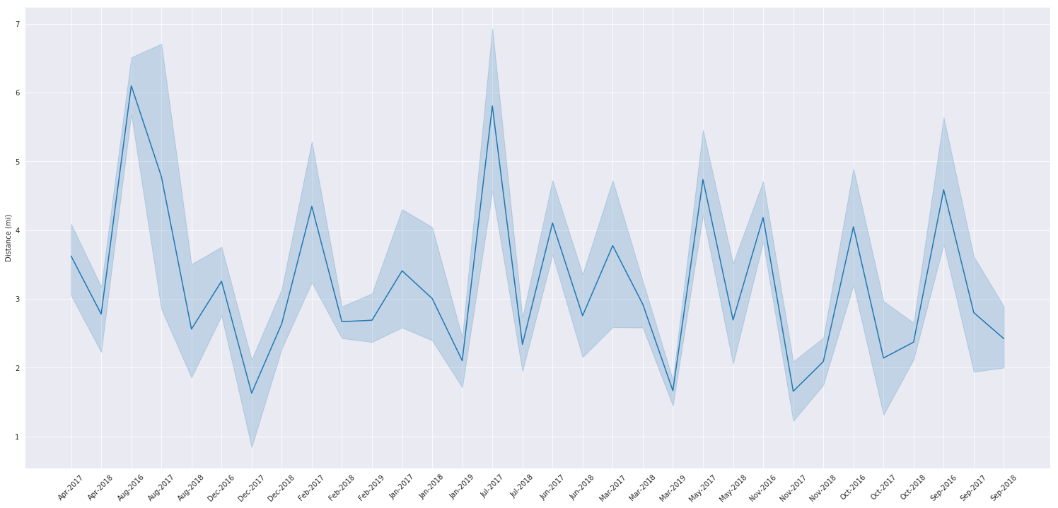
We’ll use a list comprehension to pretty up our datetime index for the graph, you can check out strftime.org to understand what I’m passing to .strftime.
Note that I’m using matplotlib’s standard api to make adjustments to seaborn, I can do this because seaborn is just an extension of matplotlib.
pretty_dates = [pd.to_datetime(x).strftime('%b-%Y') for x in monthly_steps.index]
plt.rcParams['figure.figsize'] = (26,12)
plt.xticks(rotation=45)
ax = sns.lineplot(y=monthly_steps['Distance (mi)'], x=pretty_dates)
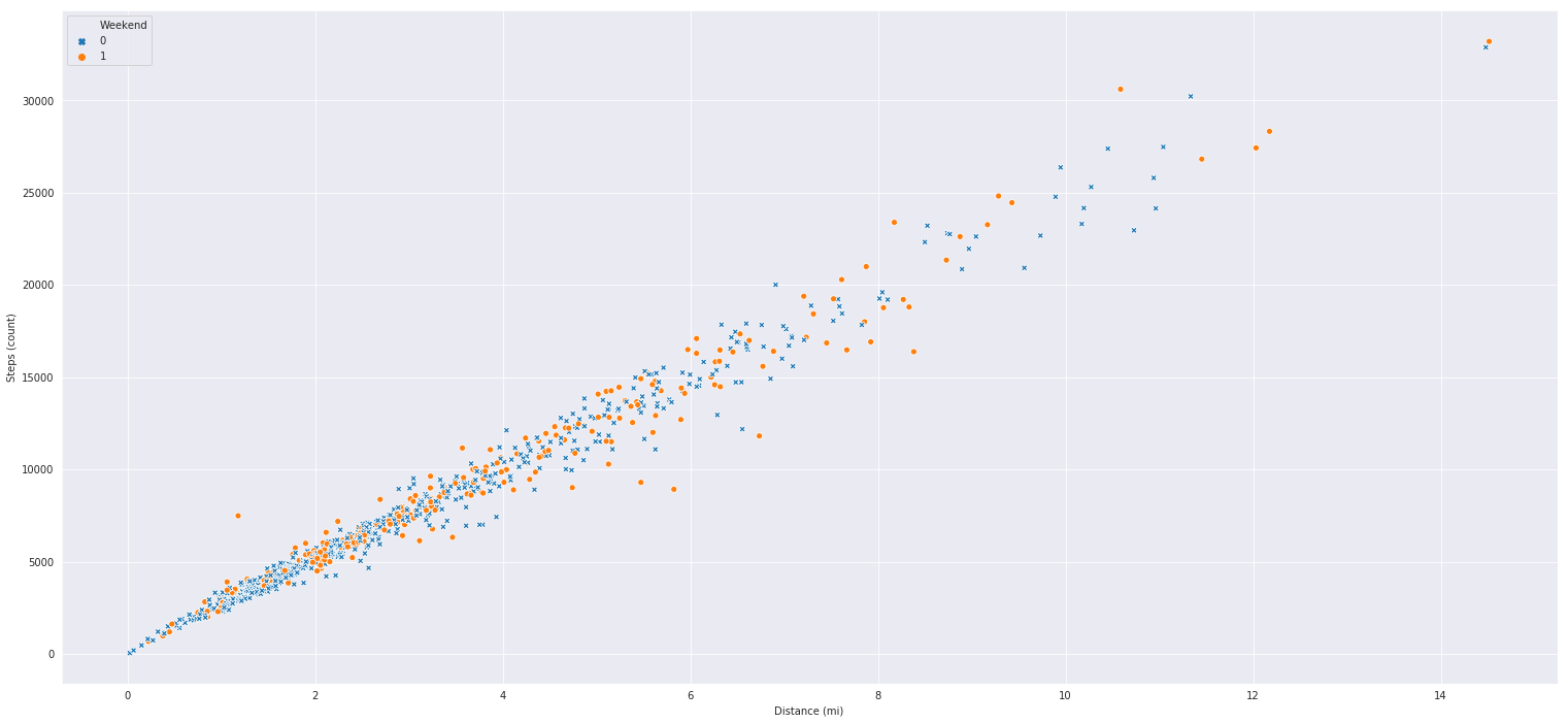
Scatter Plots
Scatter plots compare two variables along an x/y axis to show us how two variables interact with each other overtime. Bellow I have coded up a pretty straightforward relationship between
steps and distance walked. As expected we can see that as I take more steps, I tend to go log further distances. What I also included with the hue argument is weather or not a given day on
the graph is a weekend or not. I often like to use the hue argument in certain seaborn graphs to add a less important variable to the mix. Also note the inclusion of the markers argument, our weekend column is composed of 1s for weekend and 0 for not weekend, the dictionary I feed into the markers argument is simply a mapping between the labels and the kind of marker I want to use for them. You can get a list of markers to use here
markers = {1: "o", 0: "X"}

sns.scatterplot('Distance (mi)', 'Steps (count)', hue='Weekend', style='Weekend', markers=markers, data=df)
Here’s plot to try and tease out the relationship between step counts on the weekends and weekdays, note that in the above graph I set x and y positionally within the function, while in this graph I set them explicitely. You can get the order of arguments and other helpful information for a function in python by running the command help(function) or function?? in this case help(sns.scatterplot) or sns.scatterplot??. I frequently use these commands to refresh my understanding of a particular function, plus it usually matches the documentation online and is faster than using google. Also note bellow that I rename our data values in the weekend column and then set the y labels to ‘’ to remove the Weekend title. Using similar matplotlib syntax I also make the x axis title a bit bigger.
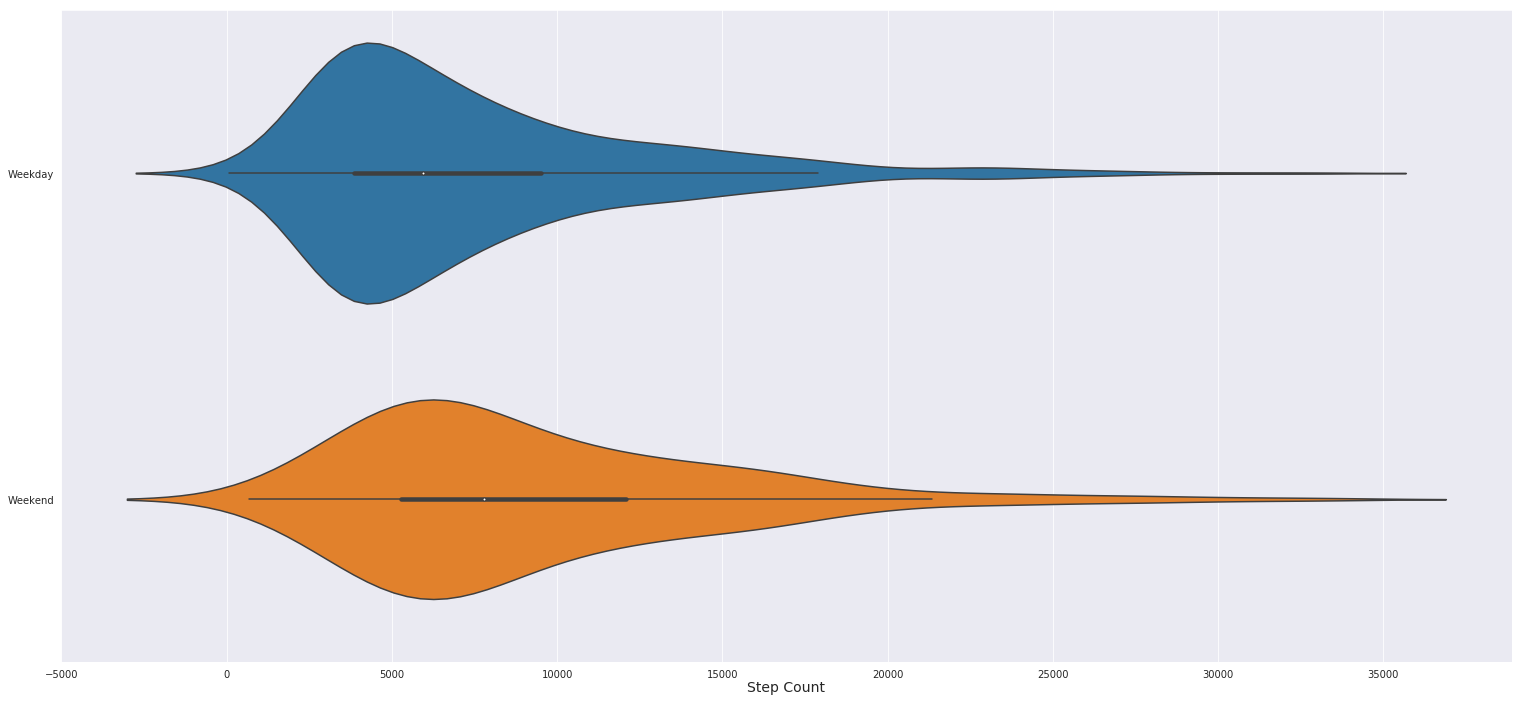
The plot bellow is a modification of the classic box and whiskers plot, called a violin plot. Basically the “violin” is fatter where there are more records the correspond to what’s on the x axis. Seaborn violin plots alos include a line through the middle of the violin shapes that get thicker between the 25% and 75% percentiles, aka the middle of the data distribution. At the median there’s a small white dot. From this chart we can see that I walk slightly more over the weekends and tend to have a more varied amounts of steps over the weekends as well. While during the weekdays I pretty much consistently walk about 4,800 steps (thank you office job!).
df['Weekend'] = df['Weekend'].replace([1,0], ['Weekend', 'Weekday'])
sns.violinplot(x='Steps (count)', y='Weekend', data=df)
plt.ylabel('')
plt.xlabel('Step Count', fontdict={'fontsize':14}, labelpad=.5)
Wrapping it up
So in this post we went over the basic usages of jupyter notebooks and demostrated it’s utility via some data engineering and visualization code. I ran each of these cells countless times in order to tweak the data or the charts to my liking. There’s still a lot one can do beyond what I’ve demostrated above but I hope this post gave you some ideas and tools to bring your data to a more presentation ready state. If someone has python + jupyter installed they can run .ipynb files themselves or you can convert the file to markdown, pdfs, html and other formats via the jupyter lab commands. Just click on the paint pallette on the left hand side of the interface and type in ‘export’ into the search field. In the next post we’ll take a curiously overlooked approach to creating a front end for our project thus far. I’ll be showing you how to run everything we’ve done so far and above from excel.
-
Quick learning moment: in the bash terminal ctrl+c is actually how you kill a bash command. When you want to shut down the jupyter server in your terminal press ctrl+c and the process will stop ↩
-
Jupyter lab is a pretty nice IDE right out of the box as the launcher suggests you can also edit text files aka python scripts or really code scripts, as well as launch a terminal or python console. ↩